Viral 'Live UI' AI Photos: 6 Evoke Templates to Boost Your Social Media Presence
The Live UI selfie trend is taking over TikTok and Instagram. Discover 6 Evoke AI templates that create the perfect live stream screen look in one tap.
- Key Takeaways
- Why "Live UI" Is the Aesthetic of May 2026
- How Evoke Built Around the Trend
- The 6 Templates, One by One
- Go Live (fun_ego_go_live_g_260509)
- Screen Selfie (fun_ego_screen_selfie_g_260511)
- Multi Me (fun_ego_multi_me_g_260509)
- Live Battle (fun_viral_live_battle_g_260509)
- Live Queen (fun_gaze_live_queen_f_260430)
- Find Me (fun_viral_find_me_g_260423)
- Pick Guide: Which Template for Which Scenario?
- How to Make a Fake Live Stream Selfie on Android in One Tap
- Evoke vs CapCut + Photoshop + Seedream
- Honest Limitations
- Trend Timing: How Long Does This Last?
- Bottom Line
- FAQ
- What is the live UI photo trend?
- Why do live stream selfies go viral on TikTok?
- Which Evoke template gives the best fake live look?
- Can I add my own viewer count overlay?
- Is the Live UI template free?
Quick Answer: 'Live UI' is the viral selfie look of May 2026—AI Photos styled as a paused live-stream screen with a red REC dot, viewer counter, and comment bubbles. Evoke offers 6 AI Image Filter templates to help you join the trend in one tap. Each renders in 3-5 seconds, powered by Google Gemini Nano Banana Pro Image. Uploads auto-delete after 48 hours.
Key Takeaways
- 6 Evoke templates released in 21 days share the "Live UI overlay" visual language: Go Live, Screen Selfie, Multi Me, Live Battle, Live Queen, and Find Me.
- AI Portrait renders complete in 3 to 5 seconds; Photo Enhance in roughly 10 seconds on Android (Google Play).
- All uploads auto-delete after 48 hours; the underlying model is Google Gemini Nano Banana Pro Image.
- Manual recreation usually means CapCut plus Photoshop plus a Seedream-style style transfer pass; Evoke collapses that into one screen.
- Limitation: the overlay text (viewer count, comments, REC dot) is baked into the template. You cannot edit the comment text or set a custom viewer number yet.
- Best results come from clean single-subject portraits. Heavily edited group shots or low-light food close-ups produce noisier overlays.
Why "Live UI" Is the Aesthetic of May 2026
If your For You page has felt suspiciously full of "candid" streamer selfies lately, you are not imagining it. The Live UI overlay - red REC dot, "12.4K viewers" counter, two or three scrolling comment bubbles - is the dominant visual grammar on TikTok and Reels right now, and the reason is structural, not stylistic.
The trend traces back to mid-May 2026, when Spanish creator Fran Pradas posted a series of fake "stadium broadcast cam" portraits on X that pulled around 20K views in a weekend. The premise was simple: take a selfie, dress it up like a major-network broadcast frame, and let viewers do a double take. Within 72 hours the format jumped platforms, and by the second week of May the broadcast cam aesthetic had been remixed into a softer live-stream UI variant applied to selfies, gaming captures, food vlogs, and OOTD posts.
Three things make it sticky. First, pseudo-authenticity - a live-stream screenshot reads as unscripted even when the subject is obviously posed, and the UI itself becomes a credibility signal. Second, FOMO - a "12K viewers" label suggests something is happening right now, which keeps viewers staring longer than they would at a normal selfie. Third, the format is native to vertical video apps; the chrome belongs there, so the brain stops asking whether it is real. Add the soft neon edge-lighting and you get a frame that performs disproportionately well in the TikTok recommendation system.
This is the same trick a luxury watch ad has pulled for decades, relocated to a phone screen. Borrow visual furniture from a context people trust, and the content inherits the trust. AI Templates make that borrow cheap.
How Evoke Built Around the Trend
Across three weeks, Evoke shipped a tight cluster of templates sharing the same overlay language. They are AI Image Filters, not video - but they ship the same chrome a real live screen would have: REC dot, viewer count, comments. Each is tuned for a different scenario, so the pick guide below matters.
All six run on the same backbone: a single portrait input, Google Gemini Nano Banana Pro Image, a 3 to 5 second AI Portrait turnaround, 48-hour auto-delete on uploads. Free to try on Android via Google Play. The pivot versus the multi-app workflow is the "All-in-One vs Multi-App Switching" angle - more below.
The 6 Templates, One by One
Go Live (fun_ego_go_live_g_260509)
Released May 9, Go Live is the flagship of the cluster and the one to try first if you have never touched the trend. It transforms a regular front-camera selfie into a clean "Going Live in 3, 2, 1..." frame: pink-and-teal neon edge light, a centered viewer counter, a discreet REC indicator in the top-left, and a stack of two comment bubbles drifting up from the bottom. It is the most generic of the six, which is the point - if you are not sure which aesthetic you want yet, Go Live behaves like the safe default.
- Best For: First-time use, generic streamer selfie, all-purpose Instagram/TikTok post
- Input: One clear front-facing portrait, no sunglasses
- Output: 9:16 frame with neon edge light and full Live UI overlay
- Mood: Friendly, plug-and-play, slightly aspirational
Screen Selfie (fun_ego_screen_selfie_g_260511)
The newest of the bunch, dated May 11. Screen Selfie skips the "going live" framing and instead simulates a paused mid-stream moment - the moment a streamer turns the camera on themselves to react to something. The composition leans tighter, the overlay is denser (three or four comment bubbles instead of two), and the lighting is warmer. If Go Live looks like the start of a stream, Screen Selfie looks like minute 47 of one.
- Best For: Reaction-style posts, "caught me mid-stream" energy, longform content thumbnails
- Input: Mid-shot portrait, eyes ideally toward camera
- Output: 9:16 frame, denser comment stack, warmer color grade
- Mood: In-the-moment, slightly chaotic, lived-in
Multi Me (fun_ego_multi_me_g_260509)
Multi Me, also from May 9, is the wildcard of the set. Instead of producing one streamer, it produces a split-screen "guest collab" layout - two or three AI-generated variants of the same subject occupying tiles that mimic a multi-guest live show. The Live UI overlay sits across the whole composition. It is the template most likely to surprise people who have only seen the generic version of the trend.
- Best For: Solo creators who want to fake a collab, creative profile pics, podcast-style stills
- Input: One portrait; the template generates the duplicate tiles
- Output: 9:16 multi-tile composition with unified Live UI chrome
- Mood: Conceptual, slightly meme-coded, attention-grabbing
Live Battle (fun_viral_live_battle_g_260509)
A direct nod to the "VS" battle layout used in real TikTok and Bigo live duels. Live Battle splits the frame down the middle, gives each side its own colored neon outline (typically red versus blue), and overlays a battle-style viewer counter and a heart-tap meter. It is loud and competitive in a way the other templates are not.
- Best For: Couple posts, friend duos, gaming clips with a sidekick, competitive vibe
- Input: A portrait that works as the "left side"; the template fills the opposing tile
- Output: 9:16 split-screen with battle chrome and dual neon outlines
- Mood: High-energy, competitive, gamified
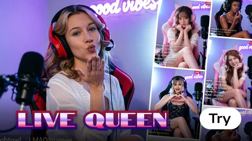
Live Queen (fun_gaze_live_queen_f_260430)
The oldest of the six, from April 30, and the most fashion-forward. Live Queen leans hard into the "fashion live shopping" aesthetic that has been huge on TikTok Shop and Douyin - softer color grading, golden particle accents, and an overlay that swaps the comment bubbles for a small "gift" stream and a follower counter. It treats the subject as the host of their own boutique stream rather than a generic streamer.
- Best For: Fashion content, OOTD posts, beauty creators, anyone who wants a regal tilt
- Input: Half-body portrait, fashion-forward outfit works best
- Output: 9:16 frame with softer grade, golden accents, and shopping-stream overlay
- Mood: Polished, fashion-editorial, premium
Find Me (fun_viral_find_me_g_260423)
The earliest entry, from April 23, and arguably the template that started the whole cluster internally. Find Me leans into the "where am I right now?" subgenre that is huge with travel creators - the AI places the subject in a recognizable but slightly stylized environment (a cafe, a rooftop, a night market) and adds a "live from..." location pill to the overlay. It is the template to use when the point of the post is the location more than the face.
- Best For: Travel posts, "guess where I am" content, location reveals, food-vlog selfies
- Input: Portrait with some headroom; the template fills the environment
- Output: 9:16 frame with location pill in the overlay and stylized background
- Mood: Wanderlust, casual, place-first
We are intentionally leaving Wheres Me (April 24) out of the six because it overlaps heavily with Find Me's location-reveal premise; if you have already used Find Me, Wheres Me will feel like a remix rather than a fresh template.
Pick Guide: Which Template for Which Scenario?
| If you want... | Use this template | Why |
|---|---|---|
| A generic, safe streamer selfie | Go Live | Cleanest overlay, neutral mood, easiest to repeat-post |
| A "caught mid-stream" reaction shot | Screen Selfie | Denser comment stack, warmer grade |
| A fake collab or split self-portrait | Multi Me | Multi-tile layout, unified Live UI chrome |
| A gaming or competitive duel vibe | Live Battle | VS split-screen, dual neon outlines |
| A fashion/beauty/queen aesthetic | Live Queen | Gold accents, shopping-stream overlay |
| A location reveal or travel post | Find Me | Stylized backdrop plus "live from..." pill |
If you are not sure which one matches your feed, the safest sequence is Go Live first, then Live Queen or Find Me depending on whether your content is fashion-led or location-led, then Live Battle or Multi Me when you want to take a swing.
How to Make a Fake Live Stream Selfie on Android in One Tap
The whole workflow, end to end:
- Open Evoke from Google Play and tap the Templates tab.
- Search "Go Live" (or any of the 6 Live UI templates — Screen Selfie, Multi Me, Live Battle, Live Queen, Find Me).
- Upload one clear front-facing portrait. Selfies work; avoid sunglasses or a brim-low hat.
- Tap Generate. The AI Image Filter renders in 3-5 seconds at 9:16 with the REC dot, viewer count, and comment bubbles baked in.
- Save the still, or feed the result into an Evoke Live Photo template to add subtle motion (blink, head turn, parallax) and export a 30-40 second 1080p MP4.
That last step is the upgrade most creators miss. A still Live UI photo reads as a screenshot. A Live UI photo animated by Live Photo reads as a paused stream — which is exactly the "is this real?" double-take the trend rewards.
Evoke vs CapCut + Photoshop + Seedream
The "do it by hand" comparison, with real numbers.
| Dimension | CapCut + Photoshop + Seedream (manual) | Evoke (Android, one tap) |
|---|---|---|
| Apps required | 3-4 (CapCut + Photoshop/Snapseed + Seedream + sometimes Canva) | 1 |
| Time per post | 15-25 minutes | 3-5 seconds for the still |
| Skill required | CapCut overlay templates, layer masking, color grading | None — pick a template |
| Output format | Editable but inconsistent across apps | 9:16 frame, consistent overlay grammar |
| Comment-text editing | Yes (manual) | No (baked-in, randomized within plausible range) |
| Cost | CapCut Pro $7.99/mo + Photoshop $20.99/mo + Seedream credits | Free on Android (ad-supported) |
| Privacy | Cloud sync on most apps | 48-hour auto-delete, no face data stored |
Evoke trades editability for speed. For trend-chasing in a 4-6 week window, that trade lands. For brand work that needs literal viewer counts and custom comment text, keep the CapCut + Photoshop chain.
Honest Limitations
A few things to know before you spam the templates:
- Overlay text is baked in. You cannot type your own comments into the bubbles or set a specific viewer number. The randomization is tuned to feel natural, but it is randomization, not authorship.
- Single-subject portraits work best. Group photos and heavily edited inputs produce overlays that drift off-center or repeat. Multi Me handles duplication intentionally; the others do not.
- Low-light or food-only close-ups underperform. The Live UI grammar leans on a face; if there is no face, the templates compensate by stylizing the background more aggressively, which is not always the look you want.
- Outputs are 9:16 only. Great for TikTok, Reels, and Shorts; not ideal for landscape YouTube thumbnails without a crop.
Trend Timing: How Long Does This Last?
Pseudo-broadcast aesthetics started narrow with the stadium cam look in mid-May 2026, then broadened into the live-stream variant within a week. Historically, UI-borrowed aesthetics burn hot for four to six weeks before the algorithm deprioritizes them, giving the Live UI look a runway through mid-to-late June. If you are going to use it, this is the window. The next visual layer to borrow is almost certainly the in-app shopping overlay, and beyond that, group video call grids - Multi Me is, intentionally or not, already pointed that way.
Bottom Line
Six templates, three weeks, one visual language. The Live UI cluster is the cleanest example yet of Evoke building around a viral aesthetic instead of chasing it. Go Live is the one-tap starting point; the other five are scenario-specific upgrades.
FAQ
What is the live UI photo trend?expand_more
The live UI photo trend is a May 2026 aesthetic where still photos are styled to look like a paused live-streaming screen - a red REC dot in the corner, a viewer counter, scrolling comment bubbles, and soft neon edge lighting. It is an outgrowth of the pseudo-broadcast trend that started with sports-broadcast cam selfies and now dominates TikTok and Reels feeds.
Why do live stream selfies go viral on TikTok?expand_more
Three reasons. First, the live-stream UI signals "this is happening right now," which triggers FOMO and keeps viewers on the post longer. Second, the chrome looks native to the platform, so it reads as authentic even when the subject is obviously posed. Third, the format encourages a double take - viewers stop scrolling to check whether it is a real broadcast - and longer dwell time is what the recommendation system rewards.
Which Evoke template gives the best fake live look?expand_more
Go Live is the safest starting point - clean overlay, neutral mood, broadest scenario fit. For a more lived-in mid-stream feel, use Screen Selfie. For fashion or beauty content, Live Queen wins. For travel and location reveals, Find Me. For a competitive duo vibe, Live Battle. Multi Me is the wildcard if you want a fake collab.
Can I add my own viewer count overlay?expand_more
Not at the moment. The viewer counter, comment text, and REC indicator are baked into each template. Numbers are randomized inside a realistic range so they look plausible, but you cannot type custom comments or pin a specific viewer count. Custom overlay editing is on the roadmap; until then, this is the main tradeoff versus a manual CapCut workflow.
Is the Live UI template free?expand_more
Yes - all six Live UI templates are free to try on Evoke for Android via Google Play. AI Portrait renders complete in 3 to 5 seconds; Photo Enhance runs in roughly 10 seconds. Uploads auto-delete after 48 hours, and the underlying engine is Google Gemini Nano Banana Pro Image.
Evoke Team
AI technology experts passionate about bringing cutting-edge solutions to users worldwide.